A Ground-Up Redesign of Our Design System
Primary Role
Co-Lead
Timeframe
2025
Introduced
Design Tokens
Problem
Growing Pains. After auditing 100+ components we realized our design system had grown messy—three separate libraries, inconsistent documentation, and mismatches between what was in Figma and what was live on the site. We needed clarity, consistency, and a scalable foundation.
Components scattered between multiple libraries
Design files didn’t match production
Documentation was outdated
As a quick disclaimer, I won’t disclose the exact performance data of these campaigns to comply with my NDA. All information in this case study is my own and does not necessarily reflect the views of the employer or it’s partners.
Research Systems
We researched other systems—internally at Amazon and externally (like Material UI, Ford, and Atlassian). The best systems had:
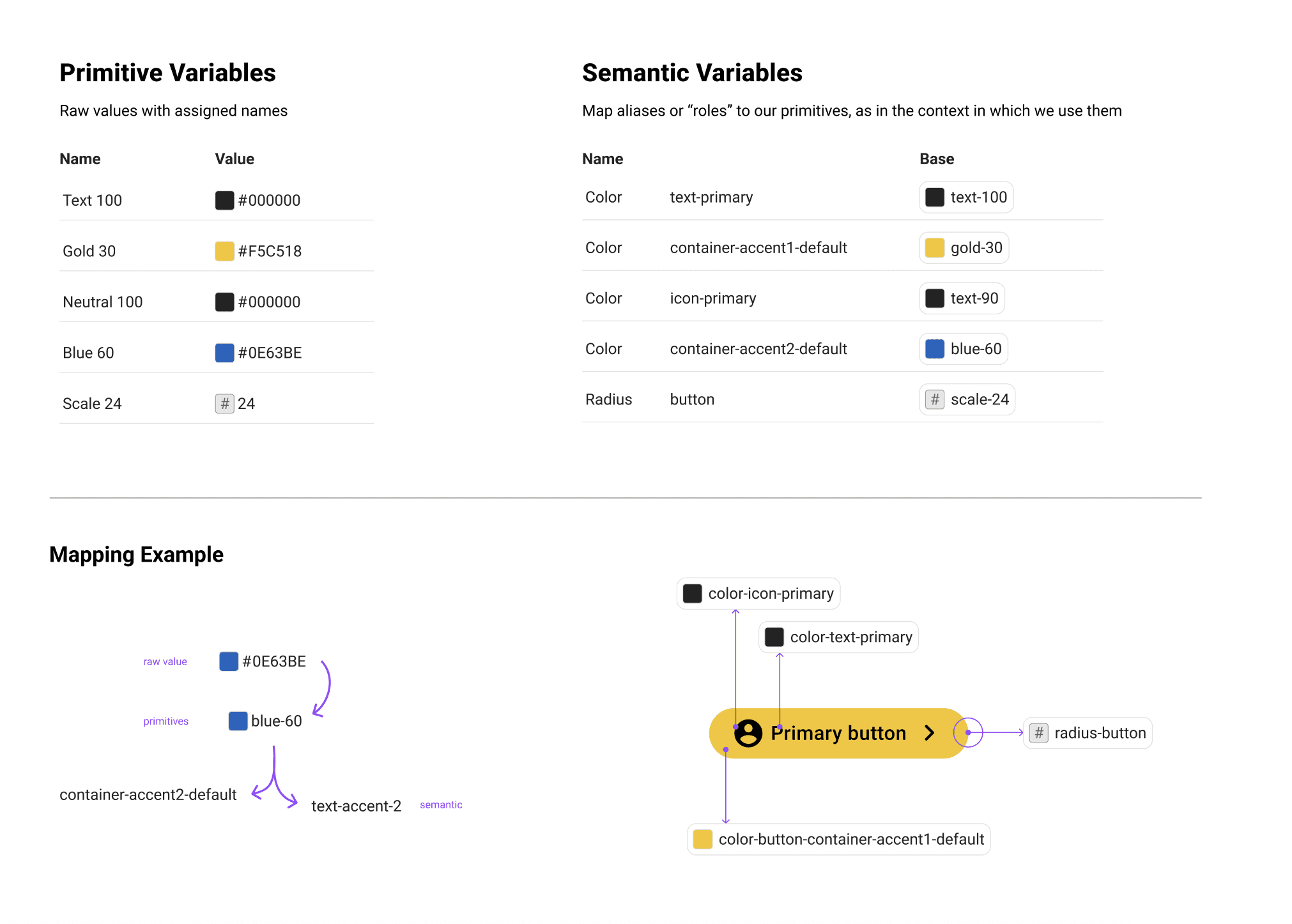
Tokenized foundations
Scalable variable architecture
Clear separation between design intent and implementation
We also explored new Figma capabilities—especially around variables, modes, and component properties. These would become central to our rebuild.
Method for Scale
No Plugins? No Problem
Due to security constraints, we couldn’t use third-party plugins for token management. That meant:
No Figma Tokens plugin
No automation helpers
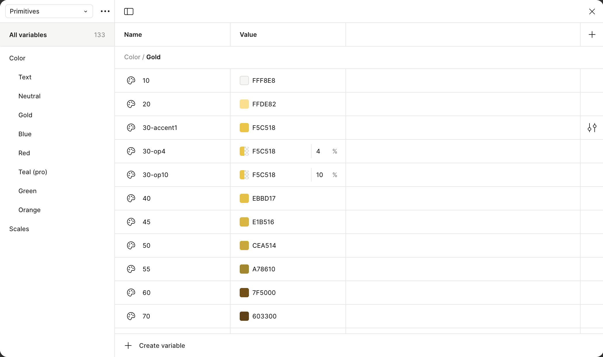
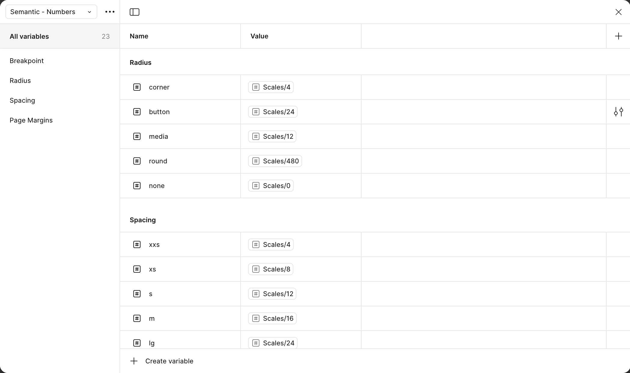
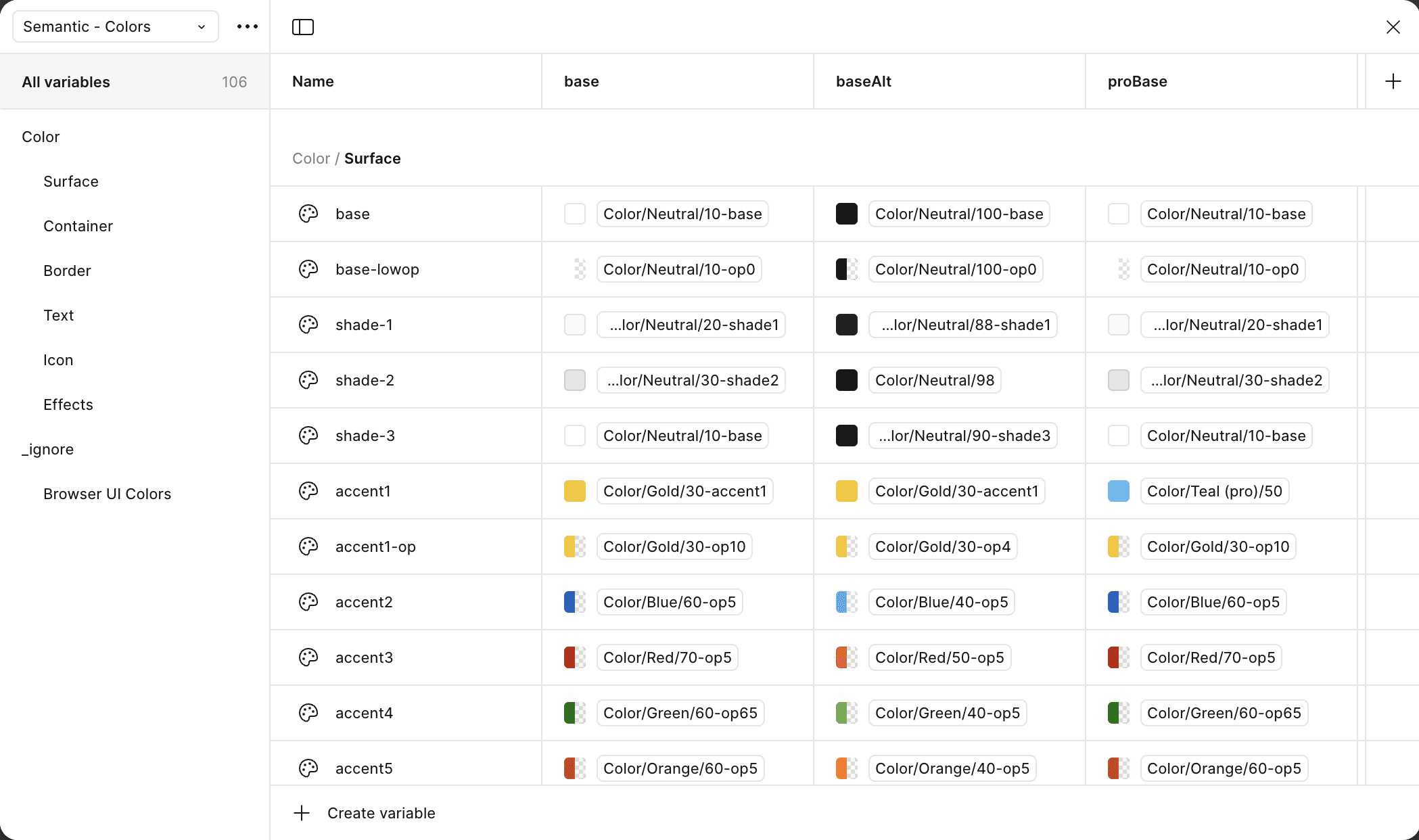
We manually built our design tokens, creating our own naming guides and documentation. While time-consuming, it gave us full control—and ensured compliance.
Trial and Error
We went through multiple iterations of our variable structure, naming systems, and how components referenced them. Once we had a working model, we began pitching the new approach:
Built proof-of-concepts
Ran internal demos
Gathered feedback early and often
This iterative approach helped us de-risk the rollout and get early buy-in.


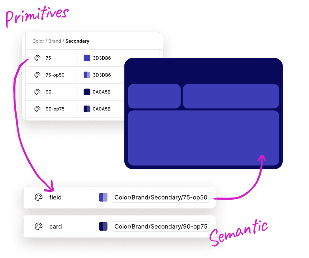
Unlocking Dark Mode
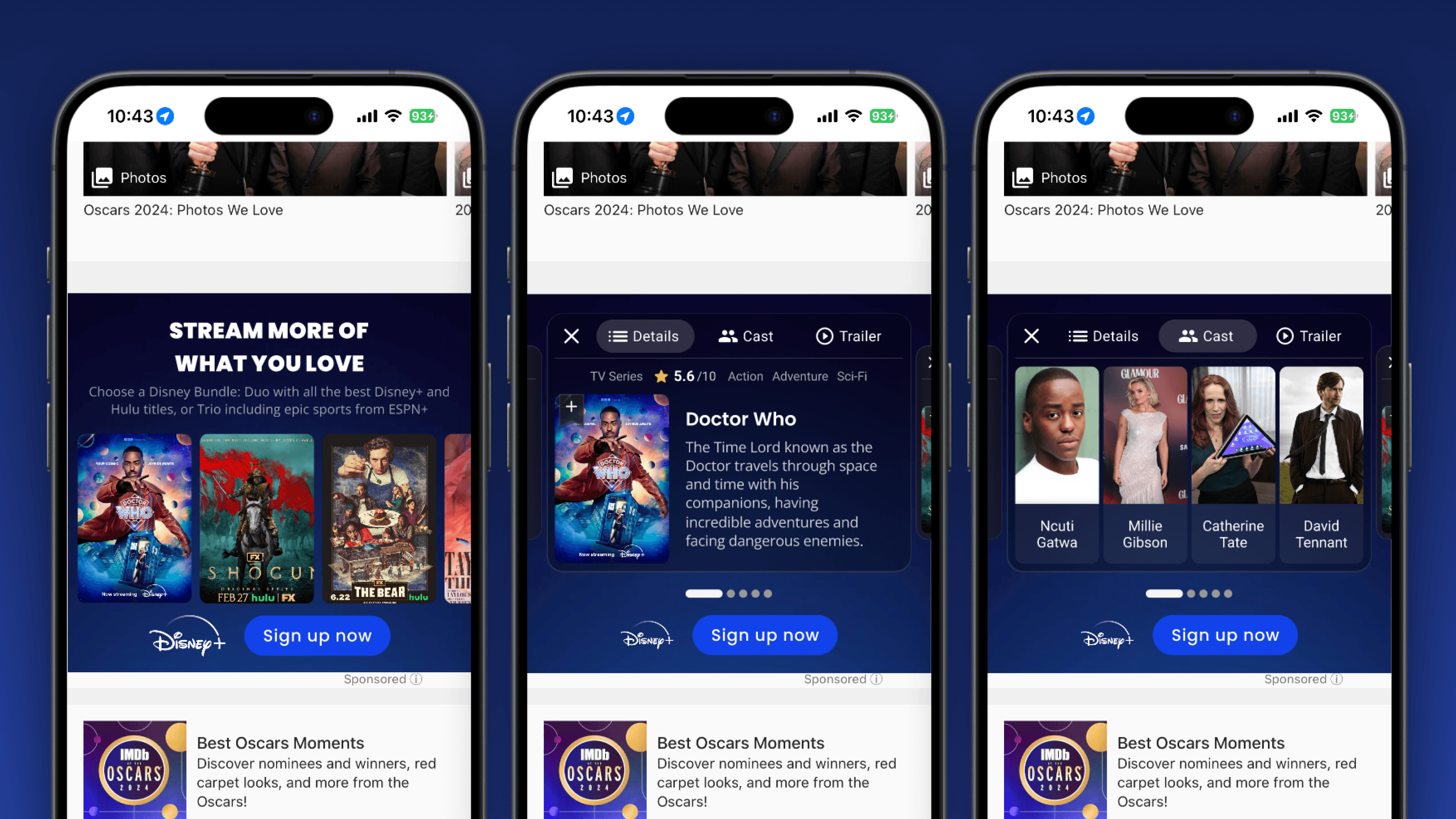
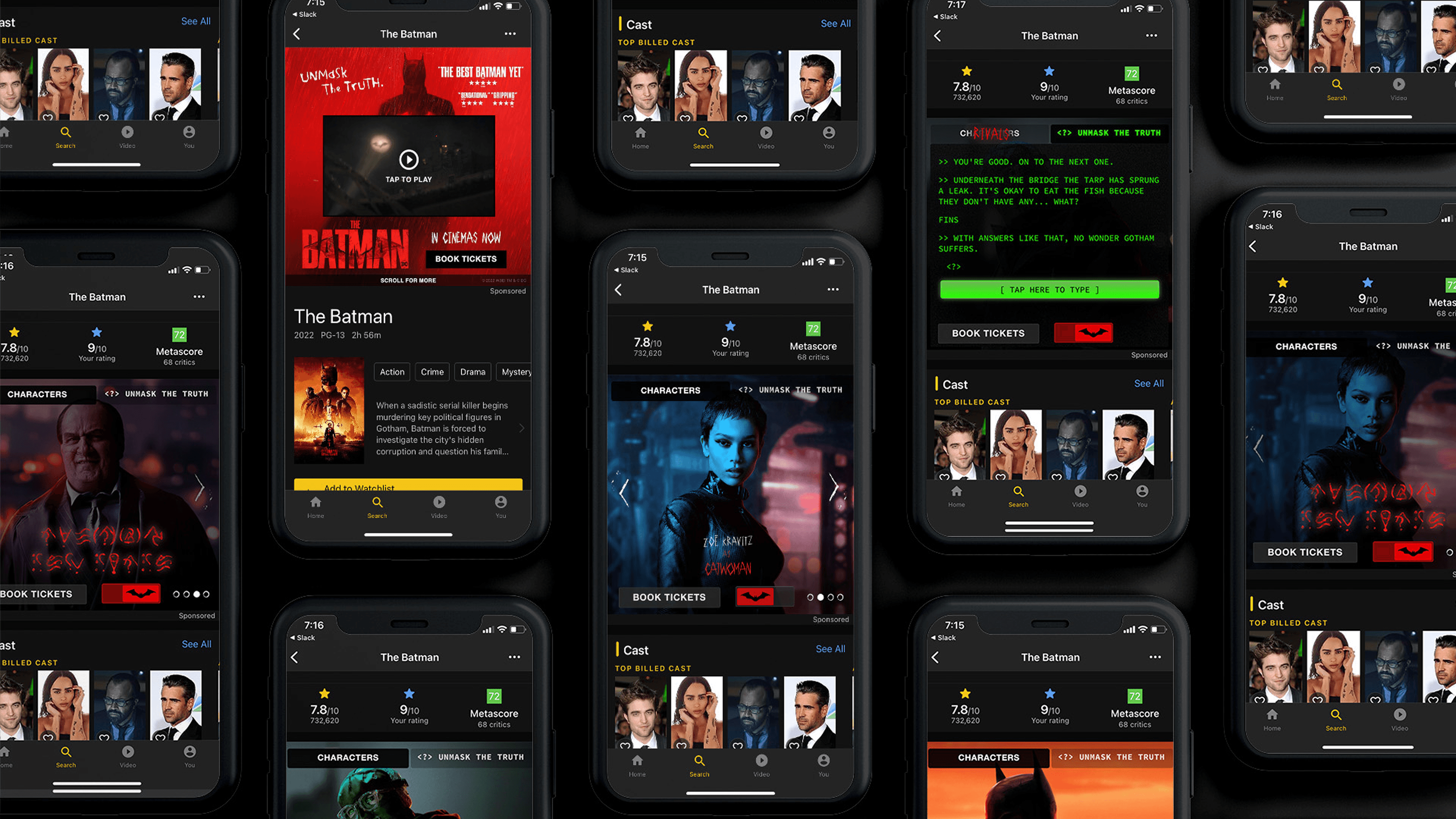
One major win: automated dark mode. By defining both light and dark values for our color tokens, and using Figma’s variable modes, we could toggle entire components without redesigning them.
Dark mode wasn’t just a nice-to-have; it validated our new foundation.
Socializing the Update
To drive adoption, we focused on communication:
Held internal demos
Created “before and after” visuals
Shared migration tips and documentation
Collected feedback regularly
Immediate Returns
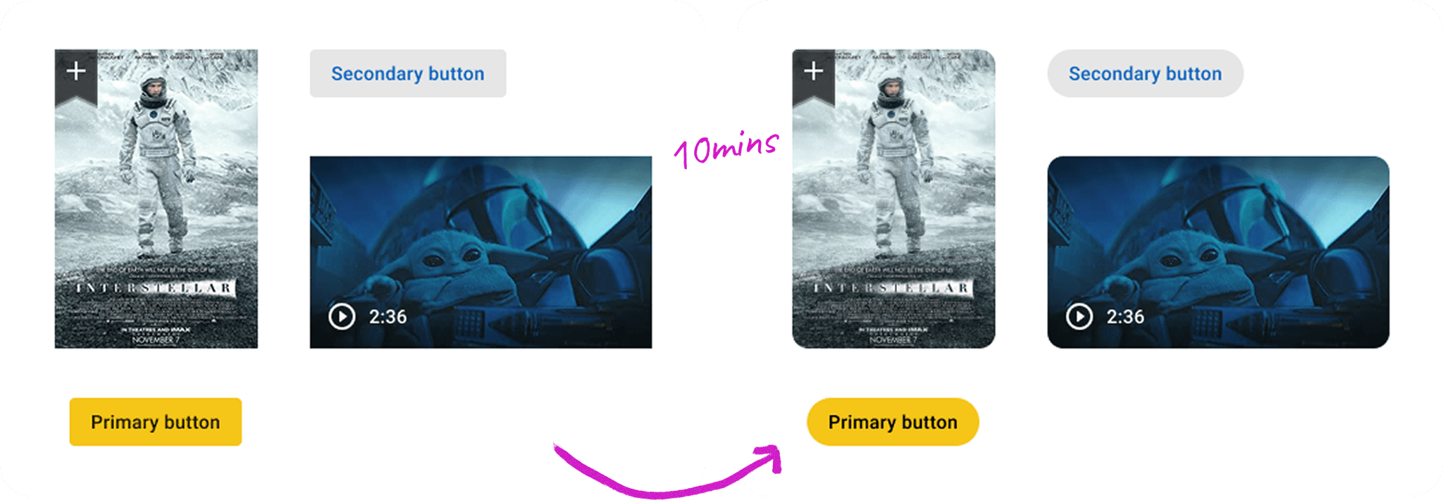
Shortly after socializing, our leaders asked that we prioritize updating ALL of our components to reflect the latest corner radius. With our work implemented, updating the entire design library took us about 10mins
Future vision
We proposed collapsing our three independent libraries into a unified, connected system:
Shared foundation tokens
Primitives and components built on those tokens
Responsive support
Cross-platform icon and asset syncing
We mocked up demos and ran responsive tests to show how this system could scale. With strong support from other stakeholders, PLAID 2.0 became our new north star.