Optimizing Ad Product UX for Scalability
Primary Role
Lead Designer
Timeframe
2024
Reduced build time by
93%
Problem
We needed to evolve an existing advertising product—the Provider Hub—to a scalable, self-serve solution. After analyzing client feedback, I focused on:
Improving usability on mobile
Adding Figma variables for rapid prototyping
Simplify the creative to require less assets
These changes not only improved the experience for end users but also lowered the barrier to entry for our clients, making it easier and faster to build campaigns using this product.
As a quick disclaimer, I won’t disclose the exact performance data of these campaigns to comply with my NDA. All information in this case study is my own and does not necessarily reflect the views of the employer or it’s partners.
Early Designs
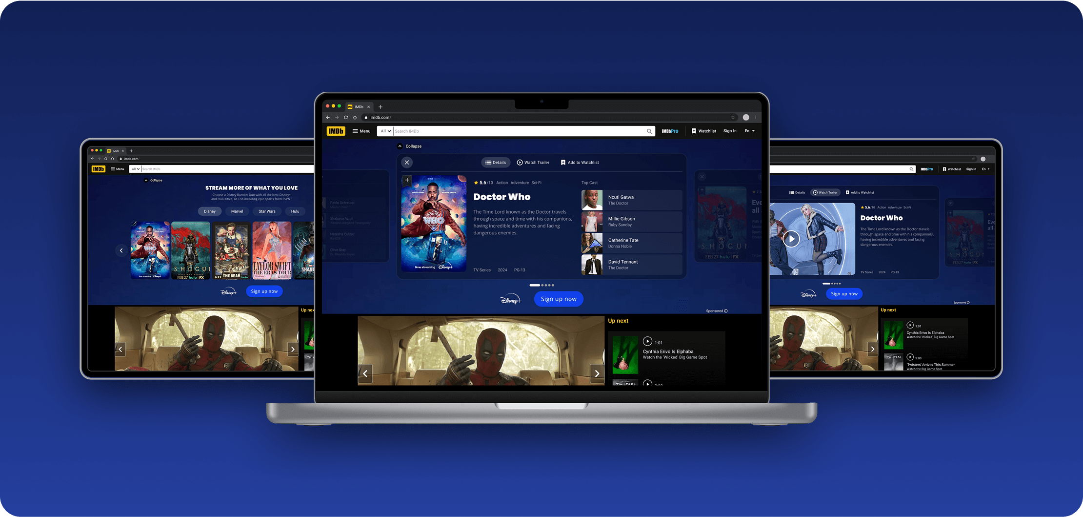
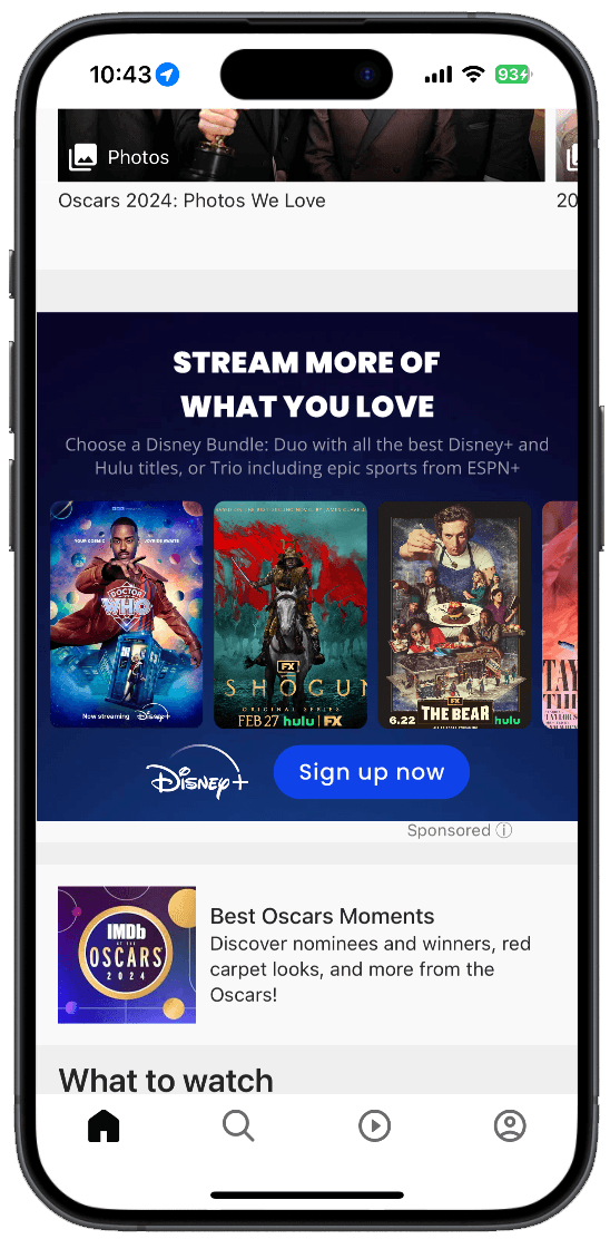
Between 2022 and 2023, our team launched a few experimental advertising products we called Provider Hubs—experiences where users could explore a set of titles from a single streaming provider and sign up to watch them.
We partnered with top clients like HBO Max and NBC to test the concept. Each version taught us something new, and with each new iteration.
My goal was to optimize both the user experience and the internal process of this existing product.
Original vs Redesign
Initial Learnings
While the concept was promising, the execution came with a lot of friction and when 2024 rolled in and more clients showed interest, I saw the opportunity to solve these long-standing pain points by redesigning the product focusing on scale and usability.
Clients needed
More flexibility on what assets are required
Clearer asset guidelines and documentation
More real estate for title descriptions
Internal challenges
Reduce number of assets (especially backgrounds)
Improve hierarchy and navigation on mobile
Create reusable design components to scale quickly
With more clarity around our API’s capabilities, we locked in the core experience—balancing user value with what was technically feasible across desktop, mobile, and app environments.
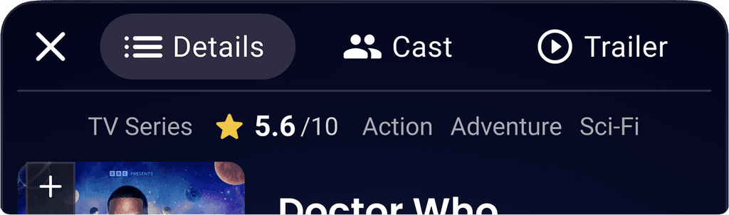
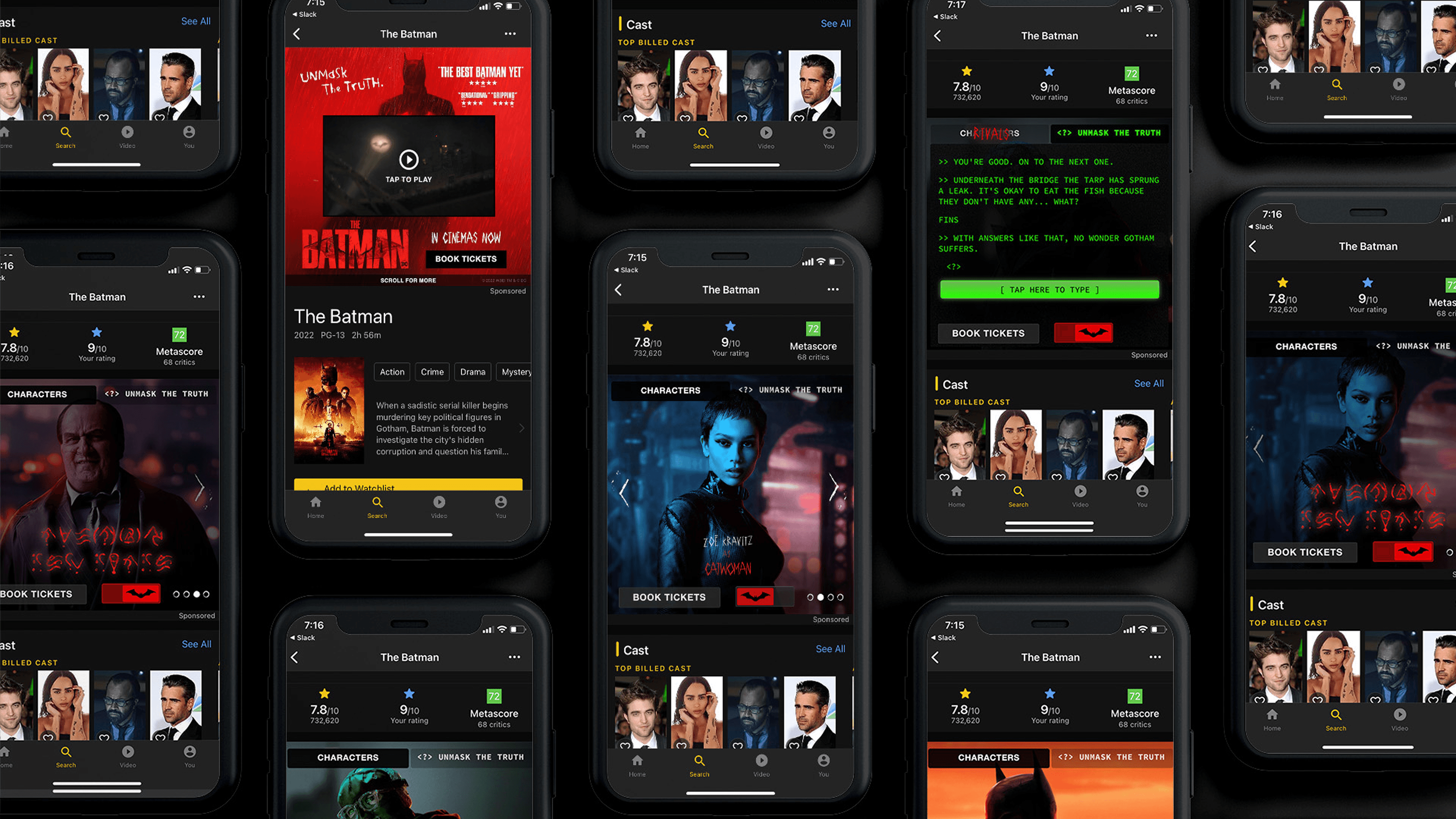
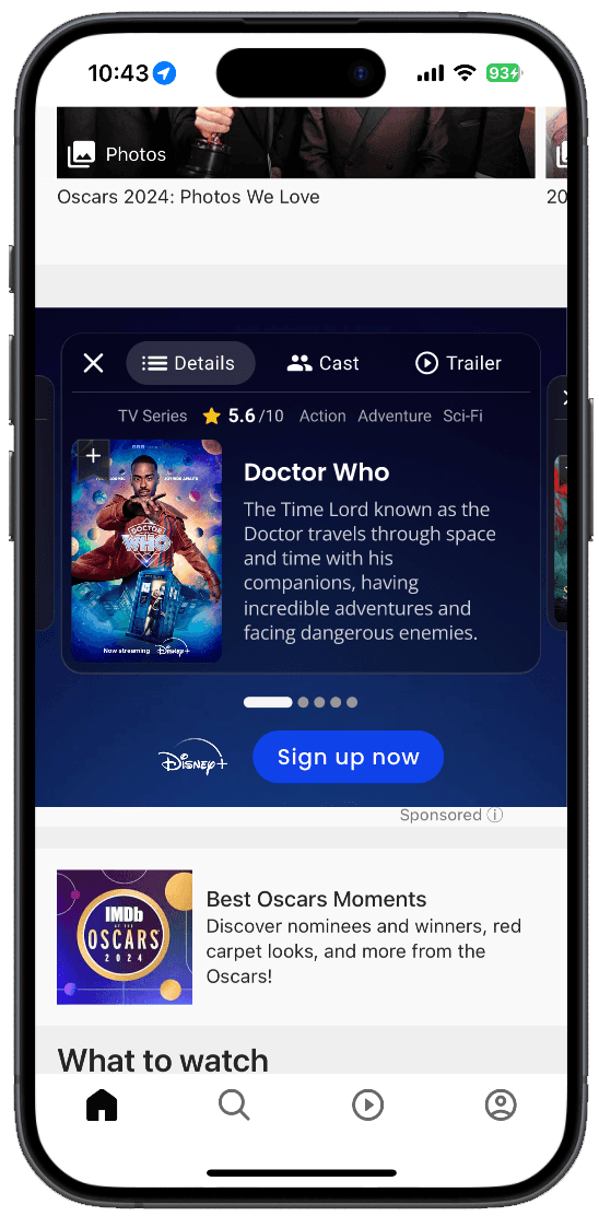
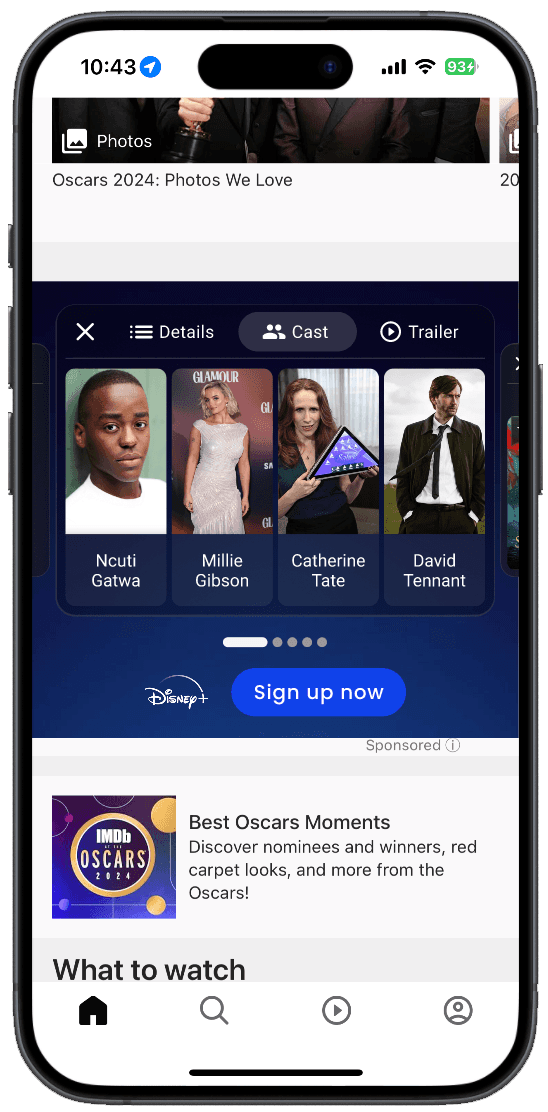
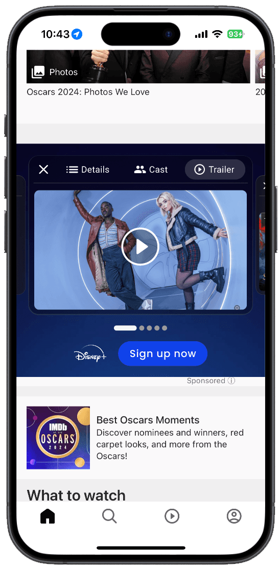
Tabs for Navigation
One of the core usability challenges was navigating between content on each title’s detail page—especially on mobile. By introducing tabbed navigation, we gave clients the flexibility to launch without trailers (and add them later), while also making it easier for users to browse through cast, synopses, and other info. This simple UI element became a powerful unlock for both flexibility and clarity.
More Room For What Matters
By restructuring the layout, I created more breathing room for title descriptions, larger text, and poster art—especially crucial on mobile. This wasn’t just about aesthetic polish; it directly supported our goal of improving readability and storytelling for each title.

One Background to Rule Them All
Previously, every title detail page had its own background—leading to over 7 background assets per campaign. I implemented a glass morphism style overlay, which allowed us to use a single global background while still offering visual depth and polish. This move cut the asset count by 86% and brought the look-and-feel closer to familiar IMDb visuals—helping users feel more at home in the experience.
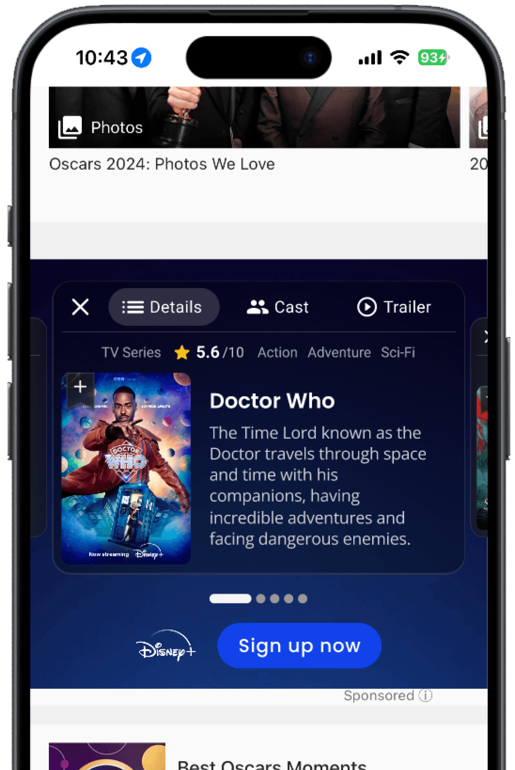
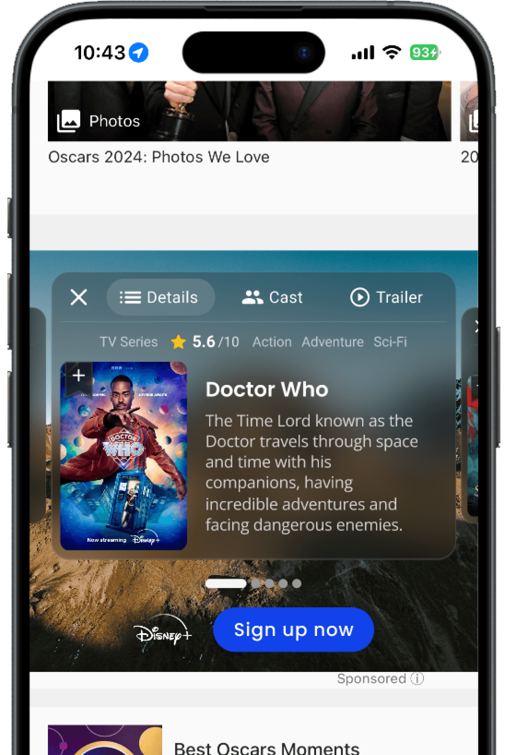
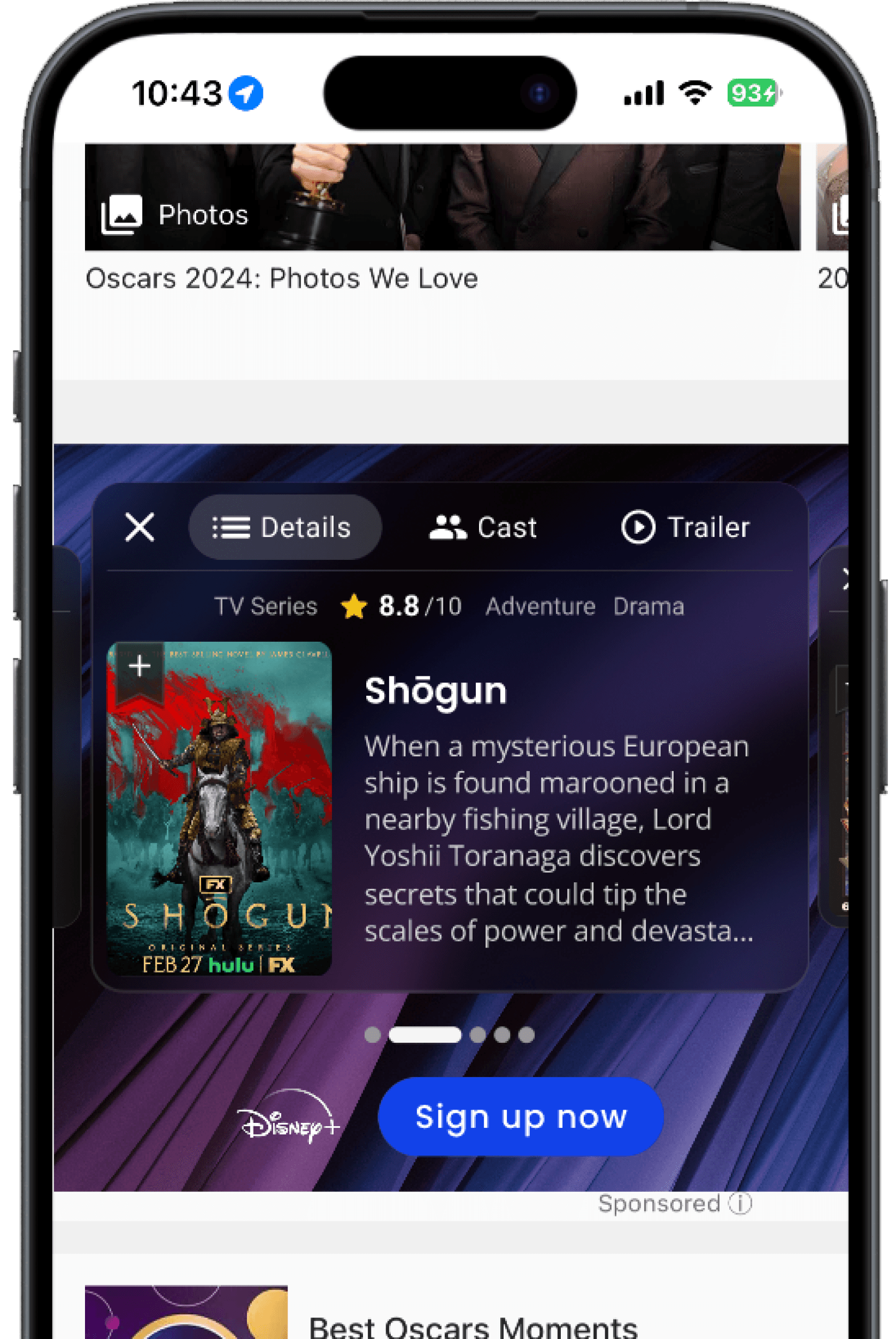
Intuitive Discovery
We tweaked card layouts and spacing so users could better understand how to navigate between titles. On mobile, narrower cards encouraged swiping, while on desktop, lower opacity previews helped set expectations.

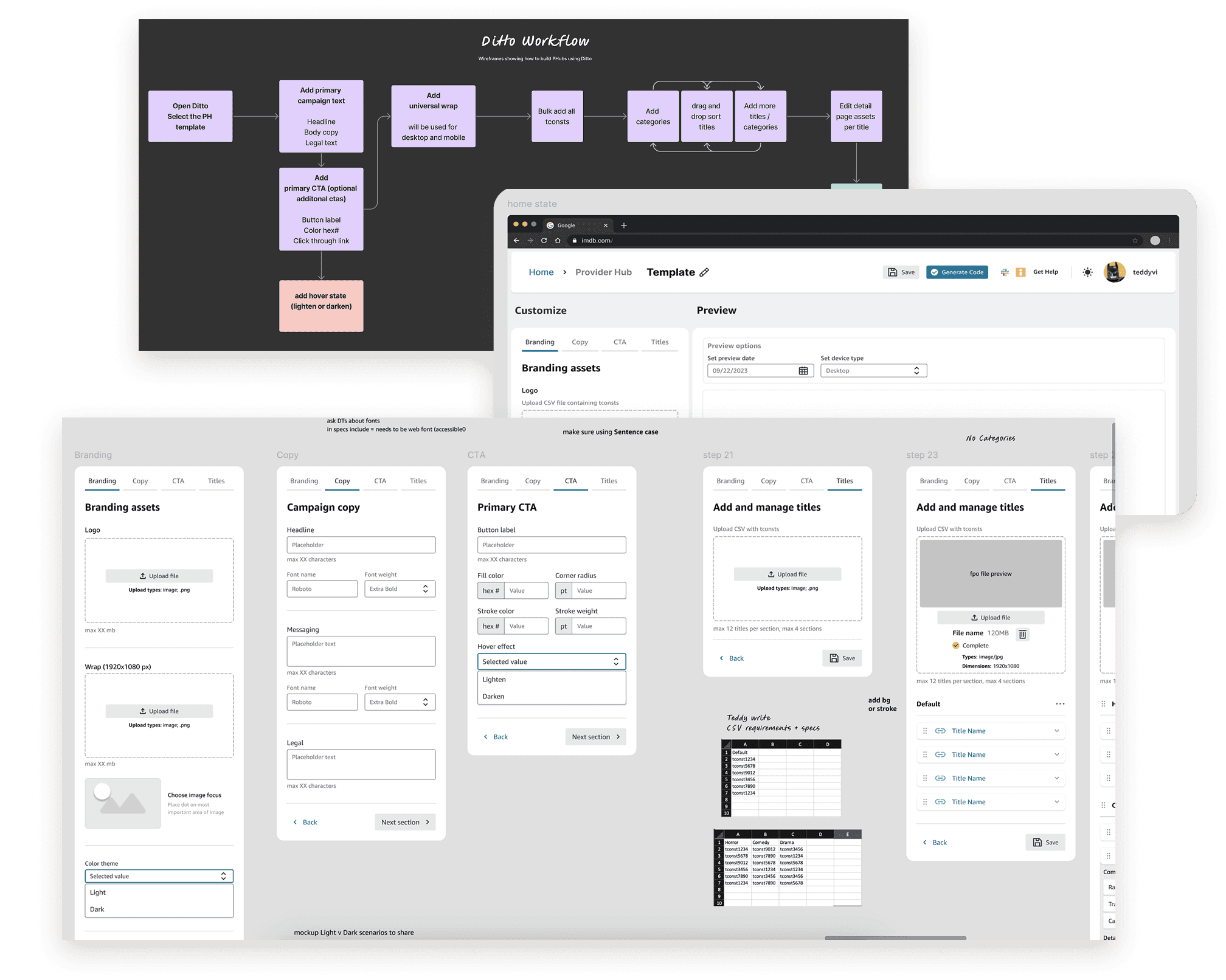
Faster mocks
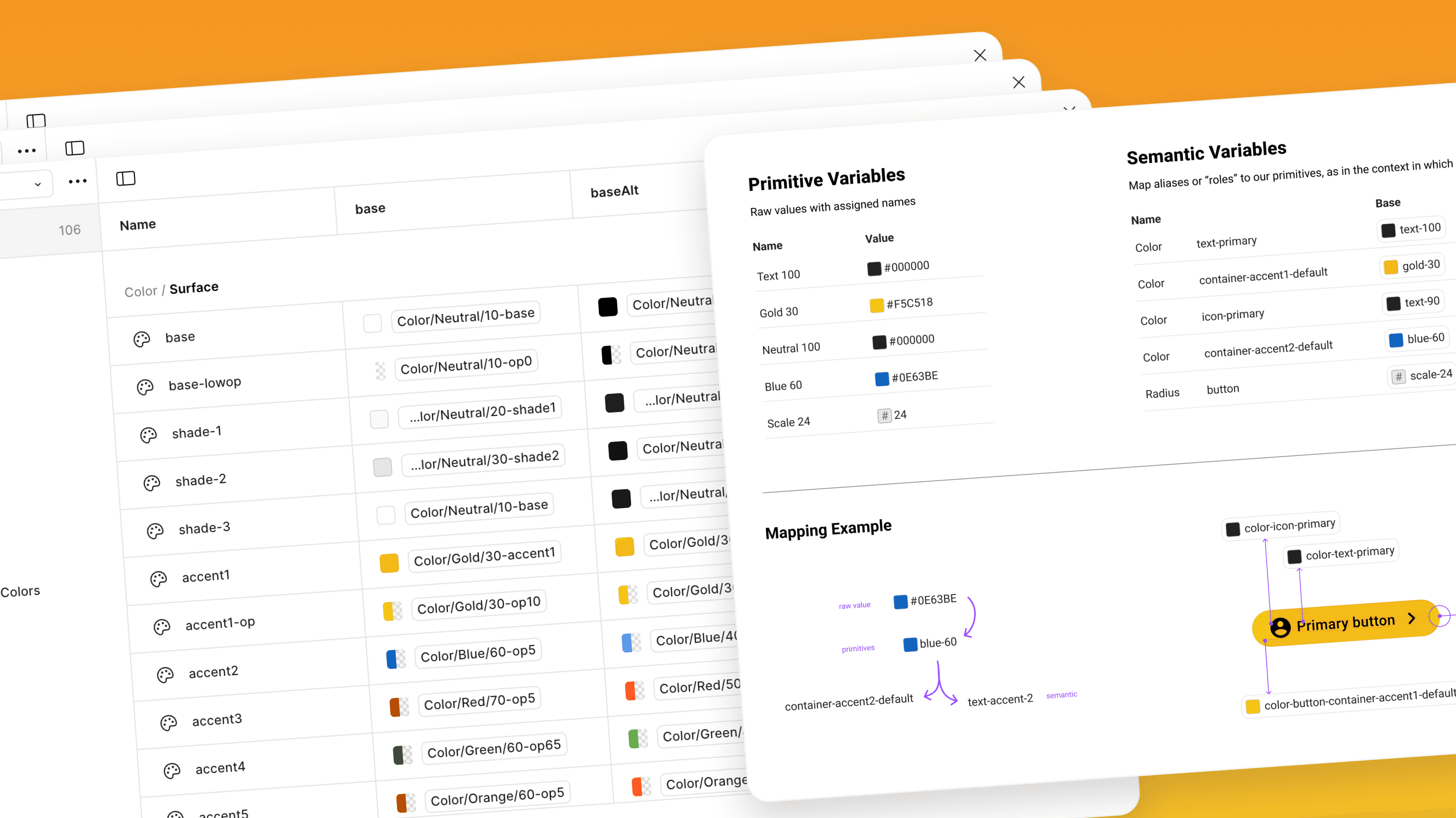
With interest growing, we needed to respond faster to mock requests. So I created a reusable Figma template that let designers plug in content and generate mocks quickly.
But I didn’t stop there. After a bit of tinkering, I discovered how to use Figma variables and used it in a way that lets designers update mock content (like colors, text, and images) through simple form-like fields. Using this technique, I slashed mock build time by 93%.
Suddenly, building a Provider Hub for sales no longer required a full week—it took a couple of hours.


Faster campaigns
Our team created a tool called Ditto to standardize campaign builds. Think of it like filling out a form that then generates a complete ad experience.
During a team offsite, I partnered with a developer and another designer to map out what a Provider Hub flow in Ditto would look like. We worked rapidly to prototype the form logic, component hierarchy, and UI flow.
Then, I continued refining the design until it was ready for development. This step brought the Provider Hub into the realm of build-it-yourself, making it accessible to non-designers and non-developers alike—unlocking scale across our ad platform.

Future Vision
Once the new template is in Ditto, we’ll have dramatically reduced the production timeline of the Provider Hub while at the same time improving the usability across platforms and creating a simpler experience for our advertising customers.